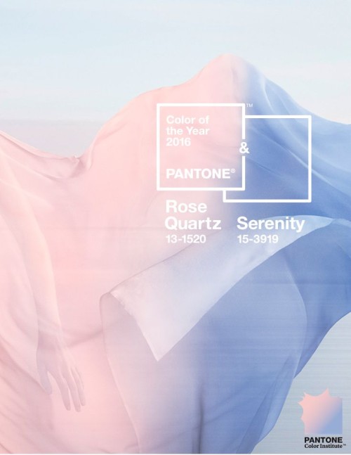
My week started with the announcement of Pantone’s Colour for 2016. I must say I was relieved to say goodbye to this year’s Marsala, not one of my favourite interior colours! For the first time, it includes the blending of two shades; Rose Quartz and Serenity. When used together Pantone suggests that a balance is created between the warm rose tones and the cooler tranquil blue, reflecting order and peace.
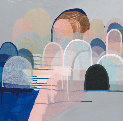
I love both of these colours individually but admit I initially struggled with how to use them together. Then I remembered this gorgeous artwork by Melbourne artist, Antoinette Ferwerda. Incorporated with soft grey, indigo blue and copper accents, these Pantone colours work so well together.
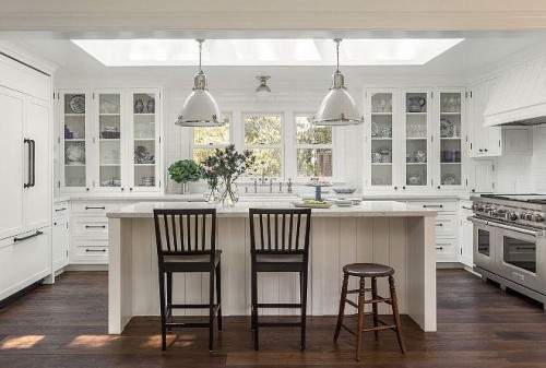
This week’s Friday’s Favourites starts with a classic white kitchen. I am loving these Ralph Lauren pendants and they are definitely on my wish list for the new build.
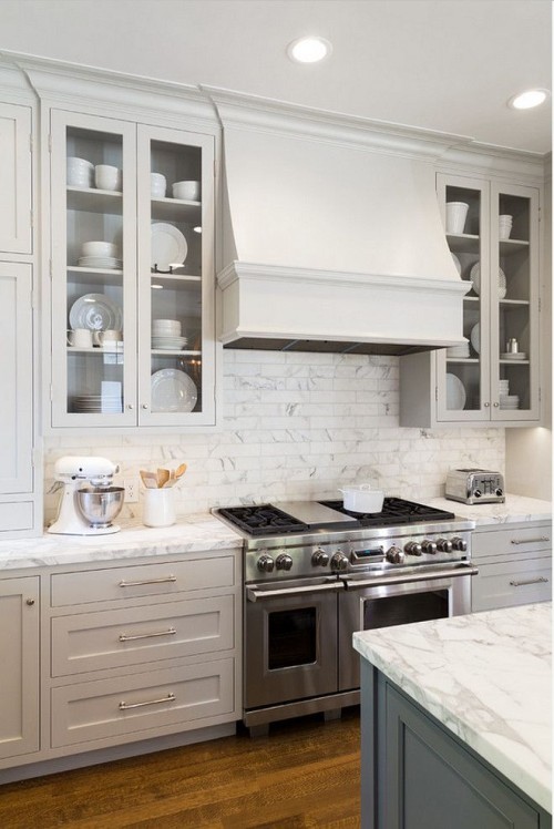
This kitchen by the same designer uses a beautiful soft grey on the cabinetry and then a darker grey for the island. These tones work so well with the Calacutta splashback tiles and benchtop.
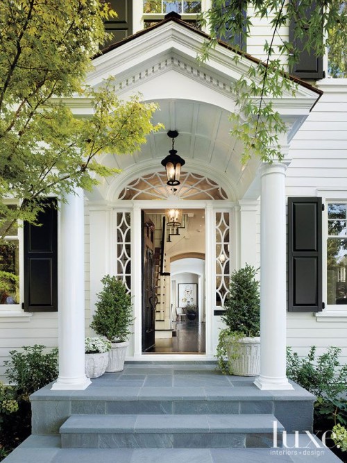
I love this house exterior but particularly the front porch. What a beautiful first impression!
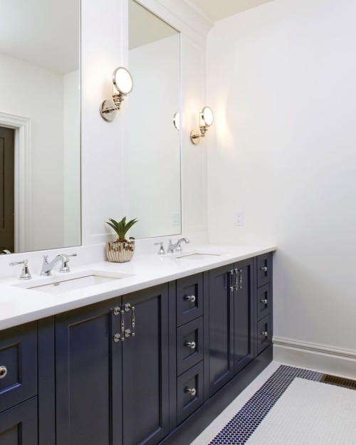
This bathroom is simple and timeless. The blue and white palette gives it a fresh feel. This detail is reflected in the penny round floor tiles.
Have a lovely weekend.